Primary navigation
Authenticated management pages group permitted destinations into collapsible sidebar sections. This keeps the complete route names and established sidebar width while letting you reduce vertical space.
Interface overview
This verified appliance view provides visual orientation before you begin.
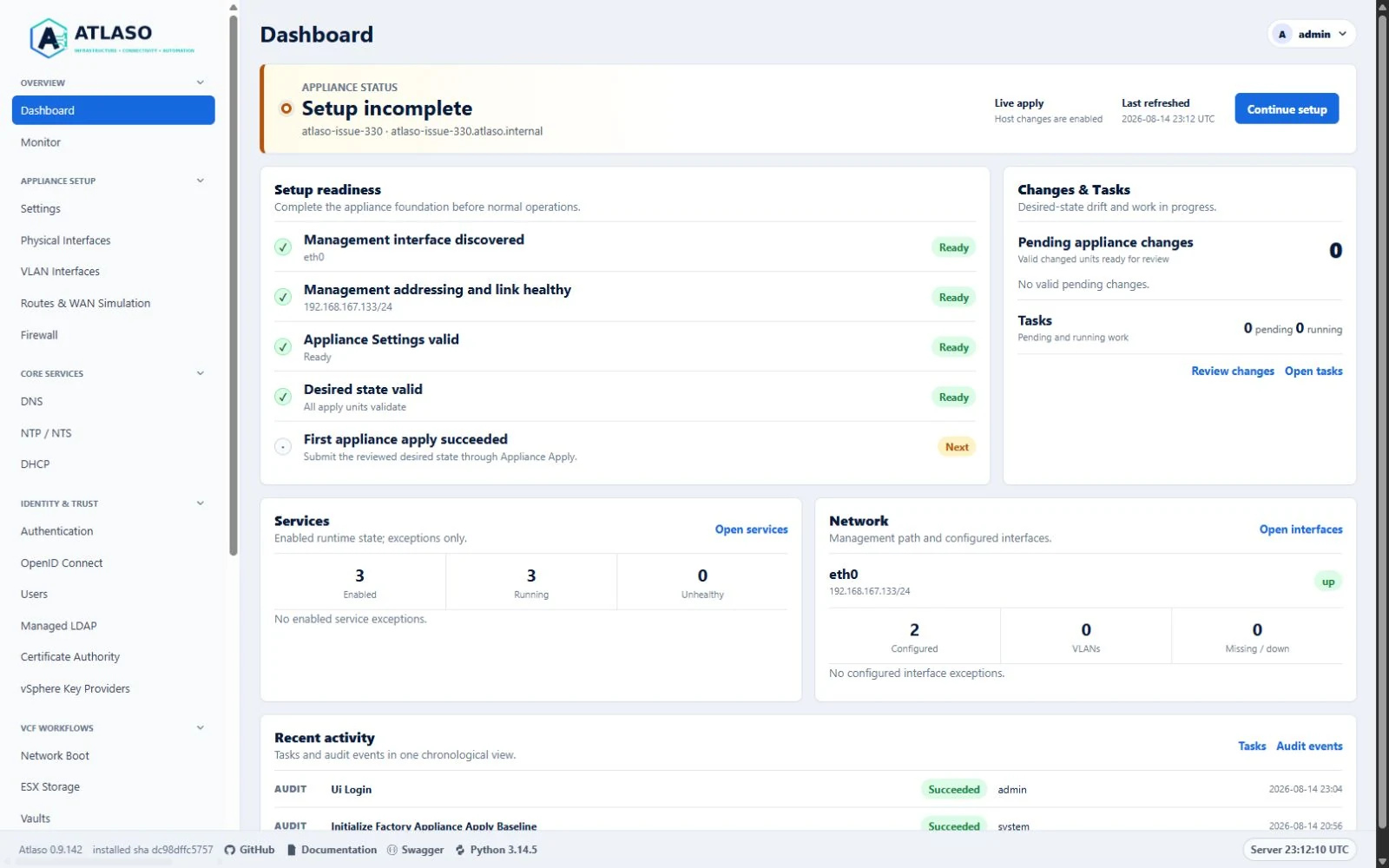
Figure: Authenticated primary navigation with every authorized section expanded.
Expand or collapse a section
- Select a section heading such as Appliance Setup or Operations.
- Confirm that the chevron changes direction and only that section's links are hidden or revealed.
- Use
Tabto move through visible controls and links. Section buttons activate withEnterorSpace.
The browser stores only expanded or collapsed choices under stable section keys. This local preference contains no credentials or appliance configuration. If storage is unavailable, malformed, or from an unsupported schema, Atlaso keeps every authorized section expanded and navigation remains usable.
Current-page behavior
On every page load, Atlaso opens the section containing the current page even when that section was previously saved as collapsed. The active link is revealed before normal keyboard focus begins. This temporary override does not replace the saved choice, so the section can return to its preferred state when another section contains the current page.
First use starts every authorized section expanded. Selecting the current section heading can still collapse it for the remainder of that page visit.
Permissions and pending changes
Atlaso applies permission filtering before it renders navigation. A section with no permitted links is absent, including its browser-state key. The server continues to enforce authorization for every destination.
The Review appliance changes card is not part of a collapsible section. It remains at the bottom of the sidebar and stays visible whenever pending desired-state units exist.
Responsive layouts
At desktop widths, sections collapse vertically inside the fixed sidebar. At the tablet breakpoint, each entire section occupies one cell of the two-column navigation layout, so a heading cannot separate from its links. Mobile layouts use one section per row and preserve the same disclosure controls.
Additional verified states
These captures show responsive layouts and useful operational states referenced by this page.
Dashboard
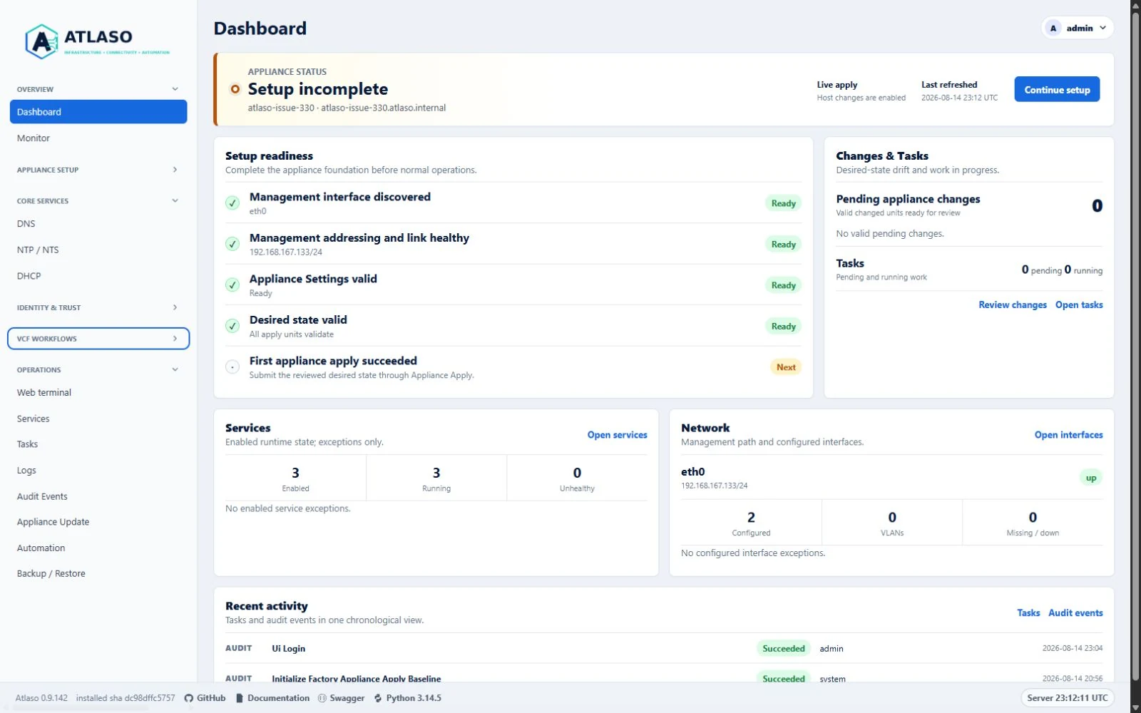
Figure: Authenticated primary navigation with independent sections partially collapsed.
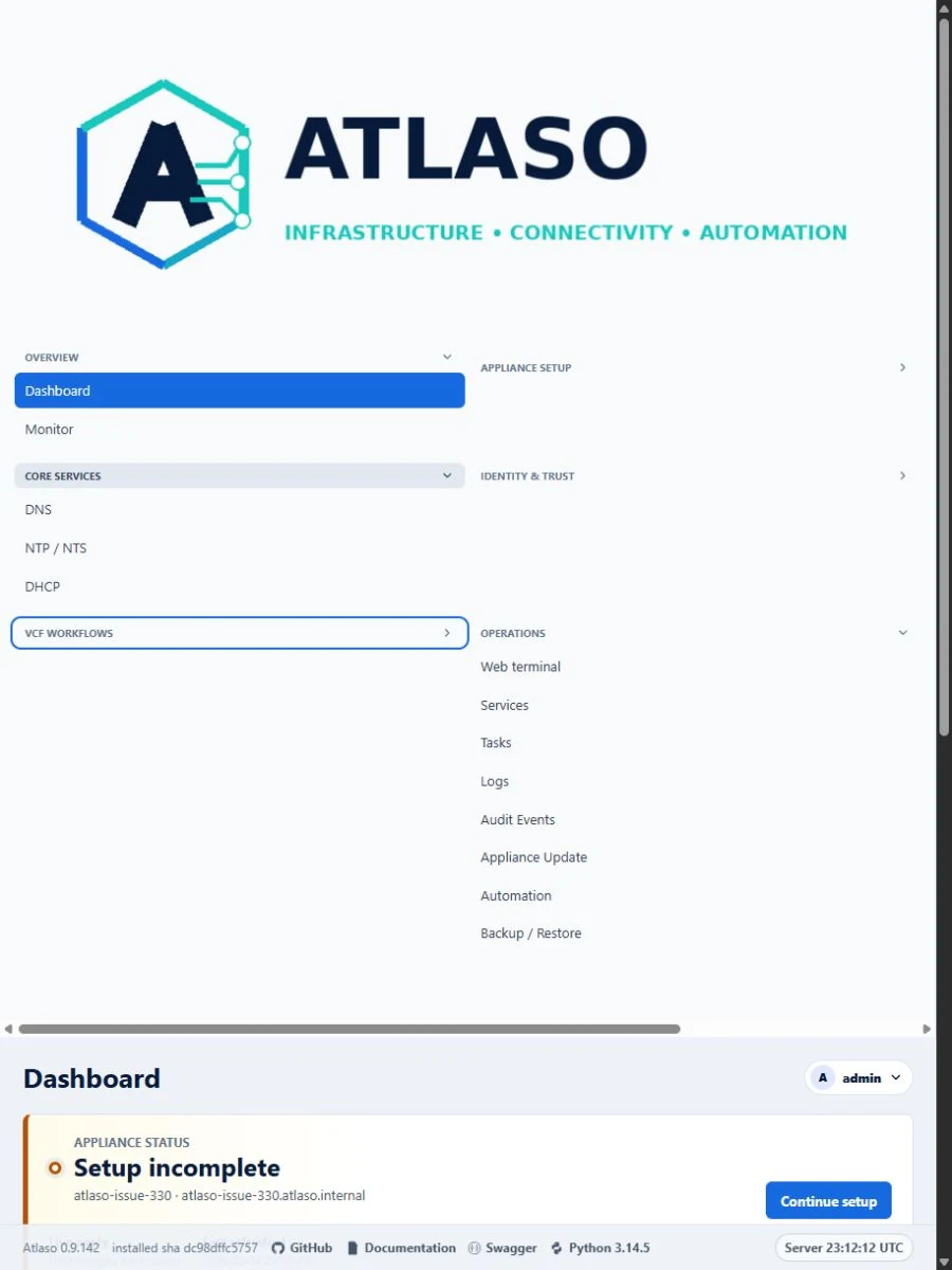
Figure: Authenticated primary navigation with complete disclosure rows at the responsive viewport.